Donations versus Death versus Geometry
Note: the original publisher of the infographic below published a revised version on 29 Aug 2014 with resized circles and additional sources.
In the wake of the ALS ice bucket challenge, there has been a lot of discussion surrounding which diseases people are willing to donate to for research and how many people actually suffer from those diseases. I've seen several people share the following infographic:
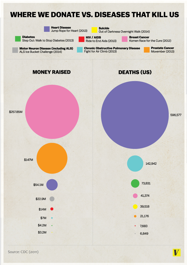
(The infographic first appeared in The truth about the Ice Bucket Challenge: Viral memes shouldn't dictate our charitable giving on Vox.com.)
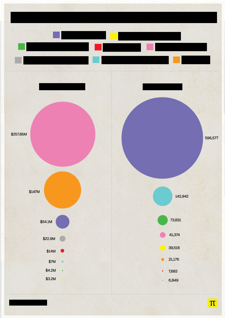
I've seen various criticisms of this graphic: Its sources are unclear, it only takes into account U.S. data, etc. But that is NOT what I want to talk about. What I want to talk about is geometry. So I have modified the infographic so that we can try to remove its political aspects and focus on the mathematical.
The first things I noticed were the purple and blue circles on the right. 596,577. 142,942. Very roughly, 600,000 and 150,000, or 4:1. (It's really closer to 4.17, but 4 is close enough.)
The area of the larger purple circle should roughly contain 4 times the area of the smaller blue circle, but it's obvious that the area is much larger than that. Here I fit 10 of the smaller blue circles within the purple circle, and there's still a lot of purple showing:
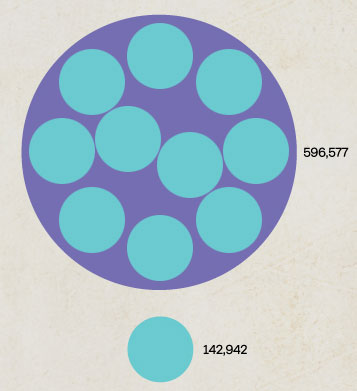
It's likely that the creator of the infographic increased the diameter of the circles in proportion to the numeric increases, essentially showing exponential changes instead of linear changes.
I set up a public Google Docs spreadsheet where I set the radius of the smallest circle in each column to 2, and then calculated the area and radii of the other circles in proportion to those. I then recreated the infographic, setting the radius of each circle in pixels to the value on the spreadsheet. Here is the revised infographic:
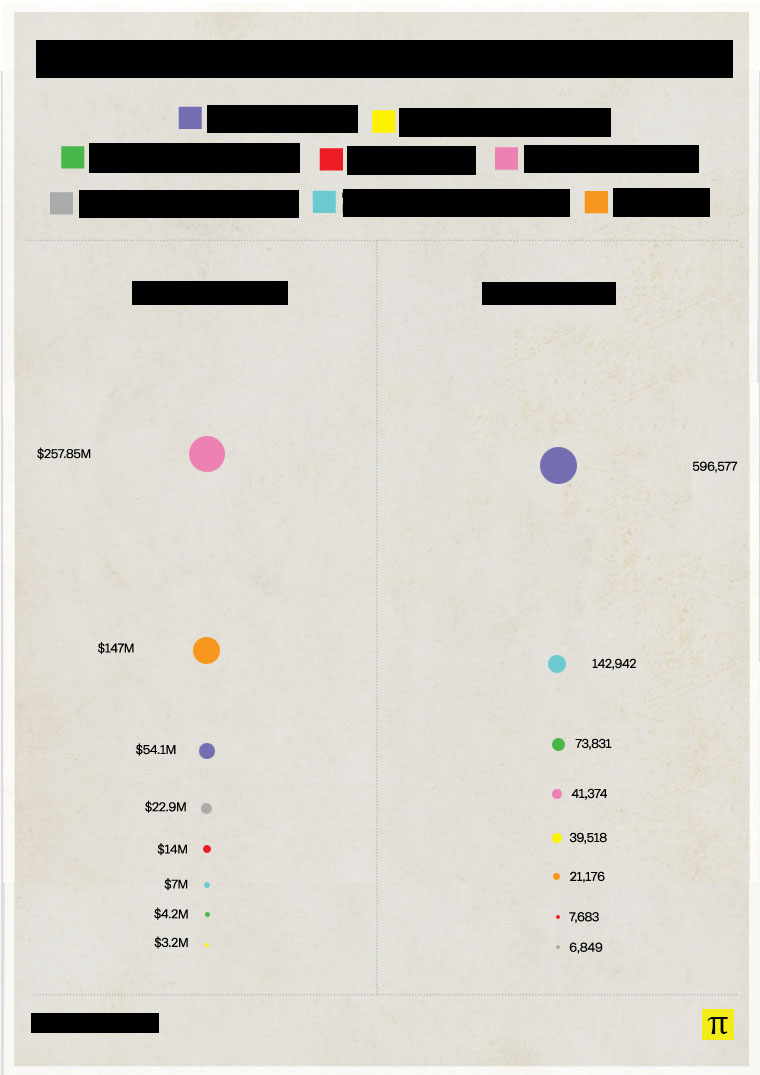
The original infographic is incredibly misleading. My advice: Stay skeptical, and remember your geometry.
Send corrections, love letters, and death threats to: chris @ osric . com