I have seen numerous instances lately where a web application requires the user to look above the form or content to instigate the next step.
Examples:
- On bordersstores.com, a 6-page list of books has the navigation at the top (and only at the top). After you scroll through the 25 items on the page, you have to scroll back up to the top to access the links to the other pages:

Hint: the links should be both above and below the content. - On Wharton’s webCafé, the “OK” button is located above the login form on a toolbar with a different background color:
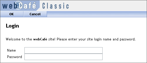
Hint: it should be underneath the login form, and it should be labeled “Sign In” instead of “OK”. - In Microsoft’s Windows Live, the “save” button is placed above the form in a toolbar with a different background color:
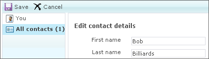
Hint: put the button below the form. (At least the button is labeled appropriately.)
In the latter 2 cases, one could argue that the button placement is similar to what a user would expect to find in a desktop application, such as Microsoft Word. But it isn’t a desktop application: it’s a web app, and users expect to find form/page actions at the bottom of the form.
You could also argue, in the last case, that the user may want to make a quick edit to the name information without editing all the details. Therefore, it is more convenient to put the “Save” button at the top. That’s fine, but why not offer 2 “Save” buttons, and put one in the spot where user’s most expect it?