This is my fourth logbook entry for my Human-Computer Interaction (HCI) course.
A few weeks ago on a Sunday morning, a piercing, ear-splitting din pervaded my apartment: the fire alarm. This is not anything like your typical household smoke detector: smoke detectors are merely loud. This sound causes pain. We managed to scoop up the cat and shove her into her carrier and head outside. Fortunately, it was a false alarm: workers in the restaurant on the ground floor of my building accidentally triggered the alarm system.
The fire department arrived and confirmed that, indeed, there was no fire. However, they did not have the code to turn off the alarm. Neither did the employees at the restaurant. I called the maintenance number for our building who relayed the top-secret code that would reset the alarm: 1-2-3-4.
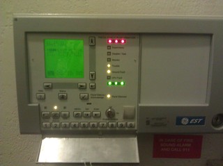
I stood by while 2 firefighters stared at the system. Presumably, they deal with a lot of false alarms, and a lot of alarm systems. But this one was not giving up its secrets so easily:

One of the firefighters typed in the reset code, as instructed. 1-2-3-4. Nothing happened. And by nothing happened, I mean not only did the piercing alarm continue blaring, but nothing even registered on the LCD screen. He pressed 1 again. And again. And again. Still nothing on the screen.
The firefighter keyed in the reset code again, this time pressing each button heavily to make sure that it was fully depressed. Still nothing on the display screen, and the alarm was still on.
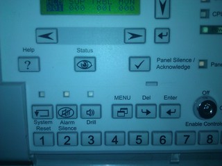
They were fed up and stepped out. They apparently couldn’t leave until the alarm was silenced, but they had no means to silence it. I started pressing buttons, and although I’m still not sure what I pressed, the alarm went quiet. Did I press System Reset? Alarm Silence? Panel Silence/Acknowledge? I have no idea what did the trick: I was just mashing buttons.
It took 3 people, including 2 experienced firefighters, to silence the alarm and we’re not actually sure how we did it!
I think there were a few things in this scenario that contributed the difficulty in using the device:
- The state of the user. I’d actually break this down into 2 components:
- Rushed. Everyone was frustrated and in a hurry to turn the alarm system off. I wanted to go back to my apartment and enjoy the rest of the morning. The firefighters probably wanted to be prepared for their next job, which might involve an actual fire.
- Distracted. Did I mention that the alarm was incredibly loud? It’s designed to be difficult to ignore!
- The experience of the user. In this case, none of us had ever used this alarm system before. The only instructions we’d received were over the phone, and then from someone who was repeating instructions from memory.
- Lack of feedback. Pressing the buttons provided no indication of the system state, including whether or not it had registered the button-press.
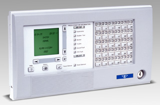
After the fact, I can see that there are a variety of features that could have helped us: a Help button, a Status button, and a Menu button. We were all too focused on the task at hand, or distracted by the noise, to explore those options. There’s also the label, Press Zone for Information, although there is no button labeled Zone. There is, however, a tiny adjacent arrow icon pointing to the blank space to the right. If the below image, from the manufacturer’s site, is any indication, that area typically is filled with a grid of buttons for different zones:

The buttons that may have been directly related to the task (Reset, Silence Alarm, Silence Panel) are too similar to each other to reveal which one was called for under the circumstances. I’m sure the procedure is obvious to anyone with a passing familiarity with the system, but as our experience shows: sometimes the users have never seen the system, have no time and no documentation, and still need to get something done.
There is one thing about the alarm panel that I think is well-designed, though: there is a hinged plastic cover that, under normal circumstances, covers the majority of the buttons (and presumably all the buttons that will let you change settings, rather than change the information displayed on-screen). This prevents residents and other visitors from accidentally changing any settings. The rest of the panel buttons are easily revealed when needed.
