Tottling around CakePHP

My research into CakePHP has, up to this point has been pretty positive. It seems to address most of the big issues I have had with other frameworks, and the code and tutorials all look good.

Because it was looking so good, I decided that I would go ahead and give it a whirl on an actual live project. I chose one that was small and urgent. (The urgent part may not have been wise, since for me personally cake is still unproven, but it seemed like a good fit) and I have been pounding out code for it since then.

So far I’m pretty happy with it, the code virtually never makes me cry, though I run into a lot of road-bumps almost all of them seem to be learning curve issues, and I haven’t actually gotten stuck on anything yet, just briefly derailed occasionally.

The Bake application that comes with cake, which is a small php script that lets you generate starting PHP code is really great for me, because it does cover a lot of gruntwork in a snap, though sometimes it crashes when I’m trying to generate specific models, but it’s probably good, for learning purposes, that I’m forced to write the occasional one by hand.

At the moment I still strongly prefer the smarty template engine to the way views are handled in cake, but the two are not incompatible, and it also may be just a case of me being set in my ways. Perhaps when I really get to know the helper functions a bit better I will be happier with this aspect of cake.

Oh, and the one thing that has caused me the most trouble so far is singular vs plural names. For some reason bake messes up the pluralizations when it is generating the rules for many to many models, and I don’t seem to have a feel for what should be singular and what should be plural.

Still, even with all the bitching I’m doing, I’m really happy with cake. I would say that development using it is going about on schedule, which is pretty good for the first time with a framework, and I feel like it is going to save me a lot of pain at the end with debugging and maintainability.

The Greater-Than Gator

I lost a lot of time yesterday thanks to tracking down an alligator in an import utility. There was one itsy-bitsy little function that wreaked big havoc, thanks to a confused gator that didn’t know which way to look.
Greater Than Alligator
That’s right, there was a < when there should have been a >. (Or since it was ColdFusion code, there was a LT where there should have been a GT.)

The import utility was developed by a guy with a masters degree in computer science, so it just goes to show you that no amount of expertise can prevent such an error (or, quite possibly in this case, a typo).

It was an easy fix, of course, but fixing all the data that had been incorrectly imported in the past took a bit longer. It cost me a few hours, but that’s better than causing a credit crisis. Either way, it reinforced in my mind the idea that we could use some unit testing around here. Sure, it might take a little extra time to write the tests, but probably less than the amount of time I spent hunting down the pesky little gator and fixing the mess it left in its wake.

strike one against cakePHP

So I’m looking into the cakePHP framework, because, well why not. (for those not in the know cake is to php as rails is to ruby) Install is quite painless, but I’m still in the documentation, and I have already bumped into something that makes me cringe. The naming conventions require some classes to be singular, and some to be plural, and there is automatic translation between the the two. (I.E. you don’t declare where the singular class should look for the plural one, it just appends an s and goes to look for it) I’m sure some of you know that English is just not that regular a language.

This of course means there has to be a way to add exceptions

Cake’s naming conventions can be really nice – you can name your database table big_boxes, your model BigBox, your controller BigBoxesController, and everything just works together automatically. The way CakePHP knows how to tie things together is by inflecting the words between their singular and plural forms.

There are occasions (especially for our non-English speaking friends) where you may run into situations where CakePHP’s inflector (the class that pluralizes, singularizes, camelCases, and under_scores) might not work as you’d like. If CakePHP won’t recognize your Foci or Fish, editing the custom inflections configuration file is where you can tell CakePHP about your special cases. This file is found in /app/config/inflections.php.

In this file, you will find six variables. Each allows you to fine-tune CakePHP inflection behavior.

Ugg!! I can just imagine getting caught by this one as part of a learning curve and walking away from the whole damn framework because of it. But I guess this is one open manhole cover that I managed not to fall into.

Built a Tiny Module for phpShop

So I built a tiny new module for phpShop, for one of my clients. Honestly It would have been easier to just slap the code into an already present module, but I wanted to see what it was like to add one from scratch. It was pretty painless, though the permission structure is a little weird in some ways. (I’ll go into it in more detail if anyone is curious)

Really the only thing that caught me off guard with adding a new module, was that you need to register it, and any new functions that it supports in the database. (shockingly in the module and function table respectively) Other than that you basically just write the damn things. Pretty clean and easy.

So Far phpShop is pretty sweet

Well, I have gotten shin deep into phpShop now, and at this point I’m pretty darned happy with what I have seen. Since I have been so dramatically UNHAPPY with most of the other shopping cart implementations that I have run into in PHP, this is something of a godsend. At the moment my only significant complaint is that it uses PHP directly as its template engine, and at this point I’m a HUGE fan of smarty. However I think that this can be dismissed for the moment as a small bump in the road, and if I end up using this heavily, then perhaps I will end up patching smarty onto it.

Other than that, some of the file names could be slightly more descriptive (what is the diff between p_header.ihtml s_header.ihtml and c_header.ihtml) but that would just make an already fairly gentle learning curve easier, its not really a problem.

So far, I give php shop a big thumbs up

Looking into phpShop

Well, I just grabbed a small contract to tweak some stuff in an online shopping cart called phpShop. I have had quite a few run-ins with a huge variety of carts written in PHP, and by and large they have been horrible. OScart is a train-wreck, zen cart is not pretty, but is survivable. So far though, phpShop looks sharp, clean and well written. It does seem to be a bit lightweight, but most of the time thats a good thing not a bad one. As I keep going on this, I will review phpShop in more detail.

Building your own libraries

About 4 months ago I finally got the hang of building my own libraries, and having them consistently come out as useful bits of software that I found myself reusing over and over. More than anything else I stumbled across the secret to this simply as the result of some random flailing, but it’s a very good principle, and I would like to share it because I think that it’s easily adaptable.

The secret is: Write sample code first

This is not the same thing as writing test cases first, its about figuring out how you want to USE your lib, before you sit down and write the lib. you should write sample code that makes use of your library, and if it’s ugly, then you should re-write it. Try not to worry about how you are going to actually make the library do what it will have to at all, just think about writing code exactly the way you want to, in your dream scenario, when you apply the library. Go through it, are there Param’s that can be left out most of the time because 90% of the cases they will always be the same? (set rational defaults)

Now write some more sample code, this time come up with the most absurd, obtuse, edge case applications of your library. Things that it was just not meant to do properly. Write some sample code that is able to do them. Unlike the previous sample code, this does not need to be pretty, you just need to make sure that its possible. I strongly suggest making use of optional closures in order to keep yourself out of boxes.

Now go back over your ideal sample code, polish it even more. You have probably come up with some things that could be made simpler, easier and more obvious after writing the really evil edge cases.

And then finally, start writing the actual library. Figure out how to make it leap through whatever hoops you need to in order to make it fit the sample code that you have written. Try hard not to compromise your original sample code vision. If you must, make sure that you do it in a way that leaves the sample code still graceful. (sometimes it makes sense to change several things if you have to change just one)

I have found that this leaves me with two advantages for actually re-using my libraries later:
1) When I want to use them, they tend to work just how I want them to. This is a result of writing them to an ideal use case
2) I have two big lumps of sample code so I can remember how the hell I was supposed to use them without re-reading the whole body of code. Often I actually paste the simple sample into what I’m doing and then just transform it into what I need.

UI Complaint: submit buttons above the form content

I have seen numerous instances lately where a web application requires the user to look above the form or content to instigate the next step.

Examples:

  1. On bordersstores.com, a 6-page list of books has the navigation at the top (and only at the top). After you scroll through the 25 items on the page, you have to scroll back up to the top to access the links to the other pages:
    Borders bad UI example
    Hint: the links should be both above and below the content.
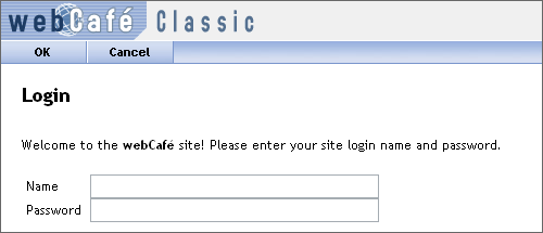
  2. On Wharton’s webCafé, the “OK” button is located above the login form on a toolbar with a different background color: WebCafe Bad UI Example
    Hint: it should be underneath the login form, and it should be labeled “Sign In” instead of “OK”.
  3. In Microsoft’s Windows Live, the “save” button is placed above the form in a toolbar with a different background color: Windows Live Bad UI
    Hint: put the button below the form. (At least the button is labeled appropriately.)
  4. In the latter 2 cases, one could argue that the button placement is similar to what a user would expect to find in a desktop application, such as Microsoft Word. But it isn’t a desktop application: it’s a web app, and users expect to find form/page actions at the bottom of the form.

    You could also argue, in the last case, that the user may want to make a quick edit to the name information without editing all the details. Therefore, it is more convenient to put the “Save” button at the top. That’s fine, but why not offer 2 “Save” buttons, and put one in the spot where user’s most expect it?

Checking for date-time conflicts

It seems like I’ve worked on a lot of applications lately that involve time slots: room reservation systems, appointment schedulers, and so on. One thing that tripped me (and some other developers) up at first was checking for conflicting time slots. It turns out, there are a variety of possible conflicts:

Conflicting Time Slots

There are 5 unique conflicts possible, and it seems like I’m always forgetting one.

Continue reading Checking for date-time conflicts

User Interface Issues

I just recently finished up some pretty cool feature adds to a lightweight CMS that I have built for a client. (they are happy and impressed with it, and It looks like I’m going to pick up another two jobs, where all I need to do is install the code I have written. Yey! I have been trying to get to that point for quite some time now)

One of the major reasons behind the feature upgrade was to fix some huge User Interface problems with “list management”, and they are fixed, but of course now that I’m playing with it, I have discovered that the new UI has some big issues as well. In particular, administrators now see the list exactly as it normally would be, but there are a few links next to each item that allow you to edit it, delete it, or move it up or down. It’s neat but the extra text very much breaks up the visual flow of the list in a lot of cases, and in one case is actually pretty darned hard to access.

Continue reading User Interface Issues