Gnuplot has plenty of examples on its histograms demo page. The demos use immigration.dat as a datasource, which you can find in gnuplot’s GitHub repository: immigration.dat data source.
While the examples demonstrate many of the available features, it’s not clear what some of the specific options do. You could read the documentation, but who has time for that? Some of us are just trying to create really simple histograms and don’t need to master the nuances of gnuplot.
Here’s my sample data, colors.data, a series of attributes and a value associates with each attribute:
#Color Count
Red 45
Orange 17
Yellow 92
Green 262
Blue 129
Purple 80
Start gnuplot:
$ gnuplotSet the style to histograms and plot the datafile:
gnuplot> set style data histograms
gnuplot> plot './colors.data' using 2:xtic(1)
The plot command above indicates that were are plotting the data from column 2, and we are using column 1 for the xtic labels (the x-axis item markers).
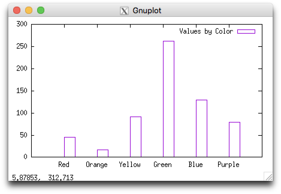
In the resulting histogram, the title says 'color.data' using using 2:xtic(1) which is not particularly meaningful. You can change this by including a title:
gnuplot> plot 'colors.data' using 2:xtic(1) title 'Values by Color'That’s it! Here’s the result:
I admit, the hollow bars were bothering me, so I make them solid:
gnuplot> set style fill solid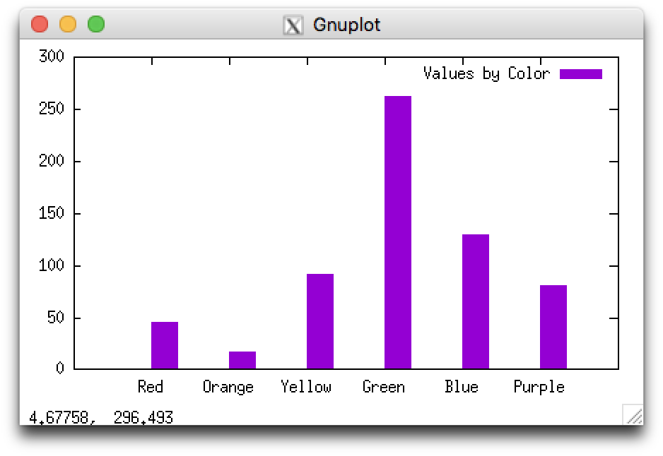
The purple color looked great, but if you’re planning to print something in black-and-white you might want to change the color as well:
gnuplot> plot './colors.data' using 2:xtic(1) linecolor 'black' title 'Values by Color'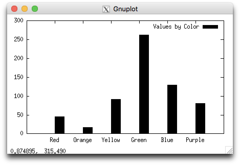
This is actually a bar graph, not a histogram, since it is only displaying one variable per group. However, if the x-axis displayed values or ranges of values it would be a histogram. The examples should still be helpful, but setting the style to histogram is unnecessary. See How do you plot bar charts in gnuplot?
You might wonder how to save the graph produced as an image file. Following the examples on How to export Gnuplot output to png, jpg and pdf I came up with this:
It no longer opens the graph in a visible window, but instead saves it to the specified file. (Using the settings from the example above, the labels on the x-axis run into each other. This could be addressed in several ways: making the graph larger, making the font smaller, or angling the xtic labels.)
To display the output to the screen again:
Nice article!
Thanks very much for this. I just wanted to visualize some simple data in a chart format. It’s so much easier to start from a basic example and then build upon it, than to try to guess what you need to know and then proceed in a trial and error fashion.