Robert Sedgewick: “Algorithms for the Masses”

On 9 April 2012, I saw Robert Sedgewick give the talk, “Algorithms for the Masses,” on the campus of Drexel University. I have several of Sedgewick’s books on my shelves at home, including Algorithms in Java, Third Edition, Parts 1-5 and Introduction to Programming in Java: An Interdisciplinary Approach. One of my previous computer science professors, Kenneth Sloan, counted Sedgewick among his classmates.

The basic thesis of the lecture was that good algorithms matter and that we need to champion good algorithms where they are most needed (particularly in the sciences).

One of his points was that computer science is currently very abstract and lacks a basis in the scientific method. Algorithms need to be tested against models to see how they actually perform. In some cases, the theoretical performance of an algorithm can be off by several orders of magnitude compared to actual performance. For example, the quicksort algorithm is quadratic (N2) in the worst case, but N log N most of the time. There’s a reason why quicksort (by the way, the subject of Sedgewick’s 1975 PhD dissertation) is widely used, in spite of the fact that it is O(N2) versus binary sort’s O(N log N).

Sedgewick said, though, that he has run into many computer scientists who fail to observe the difference between theoretical worst-case and actual performance. Some will choose an algorithm based on Big-O analysis alone. Sedgewick’s response: Big-O is an upper bound, but is your input an example of the worst-case? Probably not. Algorithms should be chosen based on their actual performance.

[As an alternative to Big-O notation, Sedgewick suggested Tilde notation, although from my perspective I don’t see that there is a great difference between them.]

He also gave an example of taking theory too far in the other direction. A computer scientist gave a talk demonstrating that his algorithm, Algorithm B, though exceedingly complex, was superior to the simpler Algorithm A. When Sedgewick asked him why, he explained that Algorithm B removed a log log N factor. Sedgewick’s analysis was that log log N, in this universe, amounts to 6 — hardly worth trading algorithms for what, realistically, amounts to a constant factor.

[Why 6? Wikipedia and other sources estimate the number of atoms in the observable universe at 1080. The natural logarithm of 1080 is 184. The natural logarithm of 184 is 5.2. 6 sounds like a fine estimate.]

Another point was that scientists often need algorithms in their daily work, but do things the hard way for a lack of knowledge. One example was a biologist who was trying to use Excel to calculate a standard deviation for over a million data points, an idea that caused several audience members to cringe.

How do we bring a better understanding of algorithms to the masses? (By masses, I think he really means the masses of college-educated scientists–not quite everyone, but still a much larger group than just computer scientists.) He had several suggestions:

Analytic Combinatorics
From what I gather, analytic combinatorics is a way of using formal languages to describe recurrence relations, and thus a simpler (and easier-to-teach) method of creating generating functions. I don’t exactly know what that means, but you can read the book on it (by Flajolet and, of course, Sedgewick): Analytic Combinatorics (PDF).

Testing Algorithms Empirically
In computer science classes, he suggests students run a program on an increasing series of inputs (e.g. n = { 1000, 2000, 4000, 8000, 16000, … }) and examining the ratios of input size to run times to understand the real impact of running in linear time, N log N time, quadratic time, etc. (This is something that some of my past computer science courses have included, so apparently they have already adopted this piece of Sedgewick’s advice.)

Changing Intro to CS Courses
Sedgewick recommends identifying core elements of computer science, such as classic algorithms, and teaching them to everyone as early as possible. Some changes made to the curriculum at Princeton (where Sedgewick teaches) have led to a dramatic increase in enrollment in intro computer science courses and from a wider range of majors.

Change Publishing
Sedgewick touted his Introduction to Programming in Java and its accompanying web site as a major change for textbooks. The programming examples are short and simple, but demonstrate a wide range of real-world applications across several branches of science. (Although he did not mention it in the lecture, I also appreciated that the examples in this book often include graphics, sound, and animation — which are far more thrilling results than the usual ASCII that intro CS students see as the fruits of their labors.)

He also criticized academic publishing for making journal articles look as much like boring print articles as possible, in spite of the fact that they are now primarily accessed online. Where are the full-color figures? The hyperlinks? Animated simulations? These things are all possible online, but instead publishers restrict content to the form that is least likely to be accessed.

Several times in the lecture, he also mentioned that freshly-minted computer scientists often have little or no background in science: no physics, no chemistry, no biology. Although he recognized this as a problem, he had no solutions (other than to, perhaps, require foundational science courses as part of a CS degree).

The last two items–changing the curriculum and publishing–really sounded like a Sedgewick paid-programming infomercial. “Everyone should take courses in the subject of which I am an expert, and they should use the book I wrote to teach it.” It was hard not to be a little skeptical of his motives. At the same time, I can’t help but think that he’s right.
Douglas Crockford: “Programming Style and Your Brain”

On 13 January, 2012, I saw Javascript expert Douglas Crockford deliver a talk titled “Programming Style and Your Brain” on the campus of the University of Pennsylvania. The brain portion of the talk (which Mr Crockford said borrowed heavily from Daniel Kahneman’s book Thinking, Fast and Slow) was really just to emphasize that human beings have 2 distinct ways of thinking: Head (slow) and Gut (fast). Computer programming requires some of both, but the same Gut-thinking that can provide useful insights can sometimes also lead us astray.

For example, programmers have been arguing since the 1970s about the placement of curly braces. Some people prefer:

if ( true ) {
doSomething();
}

Others prefer:

if ( true )
{
doSomething();
}

Crockford says that if the compiler treats these 2 forms as equivalent, then there is really no difference (so long as you are consistent). These are Gut decisions. However, people will use their Head to try to rationalize their Gut decisions and come up with some ridiculous rationalizations.

OK, fine. What does that mean in practical terms, i.e. writing code?
Continue reading Douglas Crockford: “Programming Style and Your Brain”

Test-Driven Programming Assignments

I am enrolled in another graduate course this semester, Theory of Computation. Like last semester, the programming assignments include unit tests (JUnit tests for the Java assignments). One can be very confident prior to submitting an assignment that it is done properly if it passes all the unit tests!

I’ve been interested in unit testing and test-driven development for several years now, but have never put it into practice. It seemed like a good idea in theory, but it required picking a testing framework, installing it, configuring it, and, of course, writing good tests. Without any hands-on experience, it’s a difficult practice to adopt. Getting introduced to unit tests this way lifts nearly all those burdens. On top of that, the advantages are clear: the tests will tell you when you have it right.

I was a little surprised to run into unit testing via coursework, because I’d been under the impression that computer science education focuses a lot on theory, and skips over a lot of the practice. I’ve met a lot of people coming out of computer science programs who, while probably excellent theorists, don’t know heads from tails when you sit them at a terminal. I was happy to see that my coursework included practical knowledge as well.

All the unit tests are provided by the professor. I assume we may write some tests of our own later on–and certainly nothing is stopping us from writing our own tests now–but I do wonder how many students will be prepared to take that next step. From what I understand, writing good tests is the better part of successful unit testing.

Some things I’ve noticed about the provided unit tests:

  • There are a lot of them. The unit tests are half as long the code that passes them.
  • There are many sample values to test the same function, mostly to test specific edge cases. Failure at a specific edge case helps to identify where the code went wrong.
  • In some cases, the tests are within a loop that generates random test data. Although there’s nothing quite like real human input to break your programs, 1000 random tests might help.

In practice, do programmers tend to write their own unit tests? I imagine it would be ideal if you partnered with someone, and you wrote their unit tests, and they wrote yours. It might be easy to overlook an edge case or dismiss something as impossible if you are too involved with the specifications. At the same time, it is probably difficult to write a unit test without spending some time reading the specifications and understanding exactly what it is supposed to do.

When should alt text be blank?

The alt attribute of an image element is a required HTML attribute (see the IMG element). If it is not present, screen-reader software will typically read the src attribute instead. Text-based user agents such as Lynx, or browsers that allow users to disable images, will also typically use the src attribute in the absence of the alt attribute.

I had always heard that, unless the image conveys important information (e.g. a graphic of text used as navigation, or a chart or graph) that the alt text should be left blank:
<img src="myimage.png" alt="" />

A screen-reader passes such an image over without saying anything. This makes sense to me. When I’ve closed my eyes and tried navigating the web using a screen-reader like JAWS, anything non-essential was a distraction and just got in my way. Knowing that a page contained an image of, say, a corporate headquarters in no way helped me understand the page content.

However, a colleague of mine suggested that the alt text should describe, briefly, the image. He offered a compelling use case: you are browsing on your mobile device with images disabled, due to bandwidth. How would you know if there was an image that you did want to view if no description was provided? This is a case where the alt text can provide a better user experience for users without vision impairments. But does it make the experience worse for users with vision impairments using assistive technology?

(A case could be made that vision-impaired users should also know there is an image on the page for orientation purposes: “The link to the annual report is underneath the photo of the corporate headquarters.” However, what may appear above or below on screen may not make sense when page content is read linearly.)

I looked to the WCAG 2.0 section on text alternatives, which states that images used for decoration or formatting should be implemented in such a way that they “can be ignored by assistive technology.” That’s a good case for using an empty alt attribute. If the image is sensory (WCAG 2.0 has been criticized for being vague–obviously anything visual is sensory), then the item should “at least provide descriptive identification of the non-text content.”

What about that photo of the corporate headquarters then? It’s decorative, but not in the same way as a fleuron or a border. It may not be an inspiring image, but maybe it should have associated alt text.

I decided to check 4 sites that I thought might demonstrate best-practice, but found little consistency across these examples:

  • The National Federation for the Blind – they use rather extensive alt text for the main image on their homepage: “Graphic consisting of two photos. On left is a group of children with white canes on a hayride. Right is a close-up of a finger reading Braille.” However, they fail to use the alt attribute for their menu divider graphic, which is clearly a decorative element.
  • Freedom Scientific’s JAWS Screen Reading Software – the alt text “A student uses JAWS to do work on a desktop computer” accompanies a photo of a man at a computer. Decorative images (menu dividers, stars) use an empty string for the alt text.
  • WAIM – Web Accessibility in Mind – they avoid the issue on their services page by inserting the pictures as CSS background images. These would not appear at all to a screen reader, to a text-based browser, or to a user agent with images disabled. This would be functionally equivalent to using empty alt text.
  • The Social Security Administration’s Disabilities Benefits – this page gets it completely wrong, including alt text for images that do not even appear visible to users with normal vision (e.g. a tracking image with the alt text “DCSIMG” and a spacer image with the alt text “blank space”).

MIT’s general web-accessibility guidelines offer some additional guidance:

ALT tags are often misused, mostly people overuse them. It’s better to leave the ALT tag blank (ALT=””) then to enter a text description that’s not useful or is redundant. For example an image with a caption below it does not need alt text that matches the caption, leave the alt text blank to avoid redundancy.

The University of Michigan’s Accessibility Quick Guide suggests using empty alt text for non-informative images.

Unfortunately, we’re still left with a rather vague recommendation: use a description when useful or informative. How do we decide when a description is useful or informative? My gut feeling is to agree with MIT: it should be left blank in most cases (such as with the hypothetical photograph of a corporate headquarters), but I think no great harm is done if a brief description is included.

Monitoring web server status with a shell script

Recently, my VPS (Virtual Private Server) ran into some issues where it exceeded the maximum amount of RAM allotted under my subscription. When this happens, the web server software shuts down and does not restart until I manually restart it.

This is bad. I’m not always visiting my own web site, so it could be down for days without me knowing. Although I really need to identify what is using all the RAM, in the meantime I’ll settle for a monitoring system that will notify me when the server is down.

#!/bin/bash
if curl -s --head http://osric.com/ | grep "200 OK" > /dev/null
  then 
    echo "The HTTP server on osric.com is up!" > /dev/null
  else
    echo "The HTTP server on osric.com is down!"
fi

cURL will let you retrieve a URL via the command line, and provides more options than Wget for a single URL. In this case, I used the silent switch to eliminate the status/progress output, and the head switch to retrieve only the document headers. The document header is then piped to Grep, which searches for the string “200 OK” (the HTTP status message for a successful request).

I send the result of that to /dev/null so that the output doesn’t appear on the screen.

If grep does find 200 OK, then I send a success message to /dev/null. This is largely unnecessary, but it is nice to leave in to test the script in a successful case–just remove the > /dev/null. If it doesn’t find 200 OK, then there is a problem. It might not mean, necessarily, that the web server is down, but it definitely indicates there is a problem that needs to be identified.

I added a call to this script to a crontab to run every 5 minutes. If there is no output, nothing happens. If there is output, the output is sent to me via e-mail, which, assuming I am checking my e-mail religiously, should reduce server downtime.

CSS Sprites and Accessibility

Yahoo’s Best Practices for Speeding Up Your Web Site lists minimizing HTTP requests as the very first recommendation. One of the ways they suggest doing that is by using CSS sprites (which I mentioned previously in Clever Ways to Save Bandwidth).

I recently applied this technique to a series of social media icons. Here’s an example:
http://osric.com/chris/css-sprites-social-media-icons-example.html

The example page uses a single image to display 8 separate icons from the following single image:

CSS sprites of social media icons

Be careful when using background images as links. Continue reading CSS Sprites and Accessibility

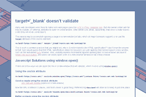
Opening links in a new window without the target attribute

Web developers often use the attribute target="_blank" to force a link to open in a new window. However, if you use an HTML validation service to check your web pages, you know that the target attribute is not valid in strict versions of HTML and XHTML.

There is a simple way to have a link open in a new window using Javascript. You may have seen code like this:
<a href="#" onclick="window.open('http://osric.net')">osric.net web hosting</a>

That method has some serious drawbacks, though:

  • The user now sees # in the browser’s status bar instead of the actual destination URL
  • The link fails if the Javascript fails (or if the browser has Javascript disabled
  • Search engines may not follow the link

I’ve written a summary of the issue and the methods I’ve found so far that best address it. I moved it to a page outside this blog because of the Javascript examples, which were easier to include on a separate page:

How to best use Javascript to open links in a new window

WordPress Security Tips

I attended the WordCamp Birmingham conference this past weekend to find out more about all things WordPress. WordPress is an open source blog engine/lightweight Content Management System (CMS) that has a huge community of users and developers, and an enormous repository of plugins to extend its functionality.

One of the presentations I attended, Mitch Canter‘s session on WordPress Security, had 6 good tips for making your WordPress-based site more secure:
Continue reading WordPress Security Tips

University of Michigan jobs site has major browser compatibility issues

At the risk of sounding like a one-note, I would like to again talk about browser compatibility issues. These compatibility issues affect an organization’s bottom line, and should not be ignored. In this particular case, The University of Michigan’s (U-M) job web site is unusable to about 10-15% of visitors, by my estimates (they are using Google Analytics on the page, so they should have that data). To me, this says that U-M may be missing out on some of the most qualified candidates for their position openings, undeniably at great cost to the organization. [I am particularly concerned in this case because U-M is my alma mater.]

In particular, the browsers that are not compatible with the U-M jobs site are Safari, Chrome, and Opera — browsers typically used by more tech-savvy users — so U-M may be missing out on the very candidates best-suited for work in today’s web-based world.
Continue reading University of Michigan jobs site has major browser compatibility issues

T-Mobile Website Unfriendly to Chrome, Safari

Early this morning, Nicola was bugging me to add a data plan to her phone account in anticipation of receiving her shiny new MyTouch. We logged on to the site using our favored browser, Google’s Chrome. Here’s what we found:

T-Mobile\'s default page in Chrome, post login
T-Mobile's default page in Chrome, post login

After several unsuccessful attempts to view info for her line from several different screens, we called T-Mobile’s customer support. The service rep walked through the same steps and said, “OK, now you should see tabs on the left with your names, phone numbers, and ‘Add A Line’.”

That’s when it hit me. I should try a different browser.
Continue reading T-Mobile Website Unfriendly to Chrome, Safari