Password Form Usability: Duke Energy

When you’re singing up with any online service, picking a password is always trouble. What weird password requirements does this service have? Tonight I had that question with Duke Energy’s sign-up form. Fortunately, they had a Help icon that described the password rules:
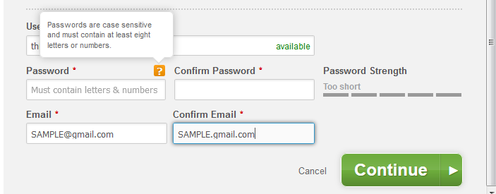
Duke Energy Sign-up Form: password rules
Text reads: Password are case-sensitive and must contain at least eight letters or numbers.

OK, minimum of 8 alphanumeric characters. Easy enough.

I use Password Safe as my password manager. I have no idea what any of my passwords are: they are auto-generated random strings. I generated a new random password and entered it into the form:
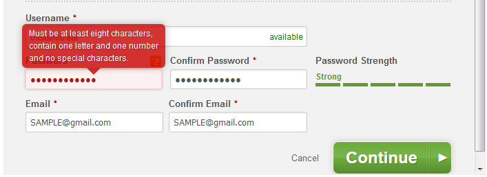
Duke Energy Form: password feedback mixed messages
Text reads: Must be at least eight characters, contain one letter and one number and no special characters.

OK, so the password rules are a little different than what was initially described. But which symbols are special characters? And this screen is sending mixed-messages: if the password strength is rated Strong, why is it not valid?

I updated the password generation rules in Password Safe to generate a new password, assuming that only alphanumeric characters are allowed:

  • Use lowercase letters, minimum 1
  • Use upper case letters, no minimum
  • Use numbers, minimum 1
  • No symbols

And, since no symbols are included, I increased the password length to 16 characters. This new password was accepted, but the feedback indicates that the password is only moderately strong!
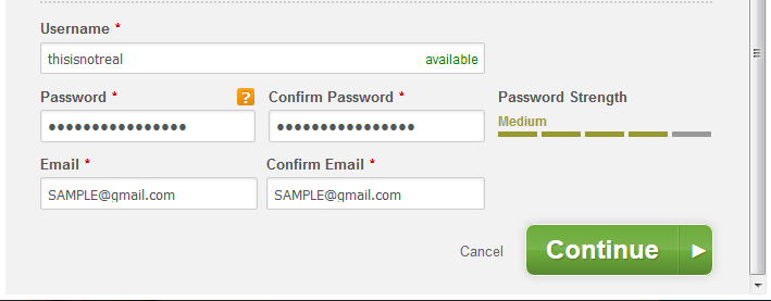
Duke Energy form: a valid password, rated moderately strong
The password is valid, but rated only moderately strong

I’m guessing that the code that generates the password strength indicator is from a 3rd-party and has no knowledge of Duke Energy’s password rules.

My problems with this, from a usability perspective:

  1. The password rules should apparent and described accurately.
  2. The password strength indicator should be aware of any password rules, and should describe a rejected password as such.

From a security perspective, I don’t see why any keyboard characters should be restricted. More characters to choose from means more complexity. Plus, if there were no character restrictions, it would be easier to describe the rules–and use an accurate 3rd-party password-strength tool.

Find Feature UI annoyance in Adobe Acrobat Pro

The Find feature in Adobe Acrobat Pro X has bothered me for some time now:

Adobe Acrobat's Find feature: note the size of the click-targets
Adobe Acrobat’s Find feature: note the size of the click-targets

The click-targets to find the previous or next occurrence of your search term are tiny. Minuscule. Verging on microscopic. Let’s say I’m searching a 600 page PDF on SharePoint and I’m looking for occurrences of the term workflow. As I click next repeatedly, trying to find the relevant section, I find that it’s very easy for my cursor to edge over just a little bit and close the Find dialog.

(Yes, I know: I can just keep pressing Enter and avoid this issue.)

Vizio Co-Star’s Google TV versus Apple TV

What kind of crazy person buys both a Vizio Co-Star (Google TV) and an Apple TV?

Apparently, I’m that kind of person.

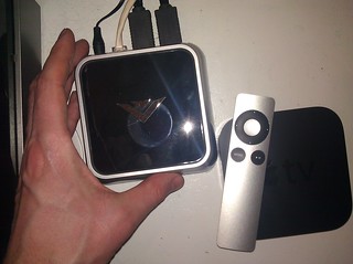
Vizio Co-Star and Apple TV

I’ve had the Vizio Co-Star for 3 months, and the Apple TV just for a couple days. Maybe that’s a source of bias, but the summary version is, despite its shortcomings, I think Vizio Co-Star provides a superior experience.

Now for the long version: Continue reading Vizio Co-Star’s Google TV versus Apple TV

How Many People Does It Take To Silence an Alarm System?

This is my fourth logbook entry for my Human-Computer Interaction (HCI) course.

A few weeks ago on a Sunday morning, a piercing, ear-splitting din pervaded my apartment: the fire alarm. This is not anything like your typical household smoke detector: smoke detectors are merely loud. This sound causes pain. We managed to scoop up the cat and shove her into her carrier and head outside. Fortunately, it was a false alarm: workers in the restaurant on the ground floor of my building accidentally triggered the alarm system.

The fire department arrived and confirmed that, indeed, there was no fire. However, they did not have the code to turn off the alarm. Neither did the employees at the restaurant. I called the maintenance number for our building who relayed the top-secret code that would reset the alarm: 1-2-3-4.
Continue reading How Many People Does It Take To Silence an Alarm System?

Big Belly Trash Cans and Usability

This is my third logbook entry for my Human-Computer Interaction (HCI) course.

A few years ago, Philadelphia replaced many of the garbage cans with BigBelly Solar trash compactors.

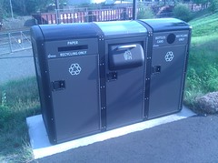
Big Belly Solar Trash Compactors
2 recycling bins and a solar compactor in Penn Park

I’d first seen Big Belly at a park in Chicago. It seemed like a great idea: the smart trash can compacts refuse so that it needs to be collected less frequently, and even sends out a signal to the grounds crew when it is full, so that there’s never an overflowing trash receptacle (the latter was a big problem in Philly, especially on weekends).

Time Magazine recently ran an article on BigBelly (“Trash Talk“), particularly citing their success in Philadelphia. I still think the solar compactors are a great improvement over the overflowing trash cans of years past. The streets are cleaner, and they save money. But from a resident’s perspective, I think they have room for improvement.
Continue reading Big Belly Trash Cans and Usability

Center City Philadelphia’s Lack of Pedestrian Signals

This is my second log-entry for my Human-Computer Interaction class this summer.

When I first moved to Center City, Philadelphia, one thing that struck me as odd was the use of regular traffic lights as pedestrian signals. Even at the intersection of two one-way streets, there would be traffic signals in all four directions. There are generally not separate pedestrian signals.


Pedestrian signals in Center City, Philadelphia

While you will find separate pedestrian signals at broad intersections, these are the exceptions rather than the rule. (Perhaps other cities do this too, but if so I have not taken notice.)

After living here for years, it very quickly becomes a part of the landscape and no longer seems abnormal. But I took notice again this year on the 4th of July: a big holiday in Philadelphia that draws a lot of tourists. I noticed a fair number of confused pedestrians, but also a couple of drivers who attempted to drive the wrong way down one-way streets.

It is a convention at most intersections in most cities that if one direction has a visible traffic light, traffic is expected to flow in that direction. Drivers from out-of-town, many of whom are not used to one-way streets, see these pedestrian signals and think they indicate the direction of traffic. But really, it’s only foot traffic, on the sidewalk, that flows that direction. Sure, there are other visible signs: one-way signs and cars parked facing only the opposite direction. In the absence of immediate oncoming traffic, though, those signals can really send the wrong signal.

Why did Philadelphia choose to use the usual automobile traffic signals for pedestrian signals? I assume it saves money: not that the signals themselves are necessarily more costly, but that one computer/controller–or perhaps a simpler controller–can manage each intersection. I don’t really know the reason, though. I definitely feel that it is a mistake to break such a common convention. On the other hand, though I have seen confused pedestrians and drivers, I have yet to see an accident caused by this confusion.Rental

Ambiguous “On” Indicators on Television Sets and Monitors

I’m currently taking a course on Human-Computer Interaction (HCI). The instructor advised us to keep logs of things we notice in the world that relate to the course material. This is one of my log entries.

One item I noticed today was the On indicator on a Samsung television at work. It’s a large flat-panel screen that we have connected to a PC for presentation purposes in a small conference room. I was preparing for a presentation and sat down at the keyboard and mouse. The power light glowed amber, so I wiggled the mouse. Nothing. I pressed CTRL-ALT-DEL. Nothing. I checked to make sure that the PC was on, and then I checked to make sure the cables were connected. Everything looked correct–why wasn’t the screen getting a signal?

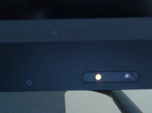
Bottom panel of a television set displaying an amber light. Note that although the indicator light is near the power symbol, it could be much closer.

Continue reading Ambiguous “On” Indicators on Television Sets and Monitors

University of Michigan jobs site has major browser compatibility issues

At the risk of sounding like a one-note, I would like to again talk about browser compatibility issues. These compatibility issues affect an organization’s bottom line, and should not be ignored. In this particular case, The University of Michigan’s (U-M) job web site is unusable to about 10-15% of visitors, by my estimates (they are using Google Analytics on the page, so they should have that data). To me, this says that U-M may be missing out on some of the most qualified candidates for their position openings, undeniably at great cost to the organization. [I am particularly concerned in this case because U-M is my alma mater.]

In particular, the browsers that are not compatible with the U-M jobs site are Safari, Chrome, and Opera — browsers typically used by more tech-savvy users — so U-M may be missing out on the very candidates best-suited for work in today’s web-based world.
Continue reading University of Michigan jobs site has major browser compatibility issues

Javascript textarea counter

I’ve been thinking more about the textarea counter issue that I mentioned in my previous post (“Users Paste Differently“).

First of all, I noticed that some of the textarea counter scripts date back to at least 2000, so this has been a problem that developers have been looking to solve for 8 years. I checked the HTML 5 specification and found that in HTML 5, the textarea element has a maxlength attribute. Presumably user agents will build in the most elegant solution.

But what is the current most elegant solution? Continue reading Javascript textarea counter

UI Complaint: submit buttons above the form content

I have seen numerous instances lately where a web application requires the user to look above the form or content to instigate the next step.

Examples:

  1. On bordersstores.com, a 6-page list of books has the navigation at the top (and only at the top). After you scroll through the 25 items on the page, you have to scroll back up to the top to access the links to the other pages:
    Borders bad UI example
    Hint: the links should be both above and below the content.
  2. On Wharton’s webCafé, the “OK” button is located above the login form on a toolbar with a different background color: WebCafe Bad UI Example
    Hint: it should be underneath the login form, and it should be labeled “Sign In” instead of “OK”.
  3. In Microsoft’s Windows Live, the “save” button is placed above the form in a toolbar with a different background color: Windows Live Bad UI
    Hint: put the button below the form. (At least the button is labeled appropriately.)
  4. In the latter 2 cases, one could argue that the button placement is similar to what a user would expect to find in a desktop application, such as Microsoft Word. But it isn’t a desktop application: it’s a web app, and users expect to find form/page actions at the bottom of the form.

    You could also argue, in the last case, that the user may want to make a quick edit to the name information without editing all the details. Therefore, it is more convenient to put the “Save” button at the top. That’s fine, but why not offer 2 “Save” buttons, and put one in the spot where user’s most expect it?